How did they do it? Kangaroo and Wattle by Linden Lancaster
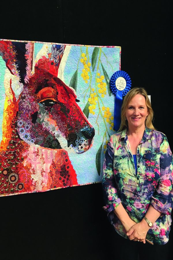
Winner of the 2017 AQC Challenge — Made in Australia: Flora & Fauna, Linden Lancaster chats with Quilter’s Companion about the creative process for her gorgeous red kangaroo and Golden wattle quilt and the subject’s reflection of the Australian spirit.
This quilt was made for the AQC 2017 Challenge — Made in Australia: Flora & Fauna. Can I ask you to describe how you came up with the idea for the quilt and what you wanted to achieve?
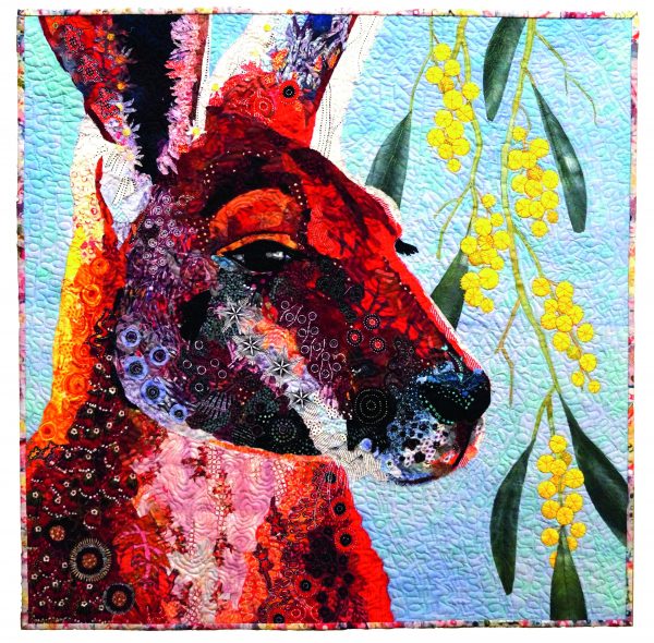
The red kangaroo and Golden wattle are famous symbols that signify the uniqueness of Australia. They both appear on the coat of arms and are part of our shared cultural history. Aboriginal Australians have utilised them in many ways for thousands of years. Tourism Australia makes use of the kangaroo in its logo to “help ensure instant recognition for Australia around the world”. The Golden wattle is our national floral emblem that inspires our nation’s colours. It has become our cherished symbol of celebration, joy, sadness and remembrance and of home wherever we may be.
A simple idea executed in a compelling manner is often a good way to go. When people think of Australia, most think of a kangaroo. But how could I make something that has been “done to death” interesting? And how could I incorporate the wattle?
Stimulate your toddler’s imagination by making them their very own indoor cubby house!
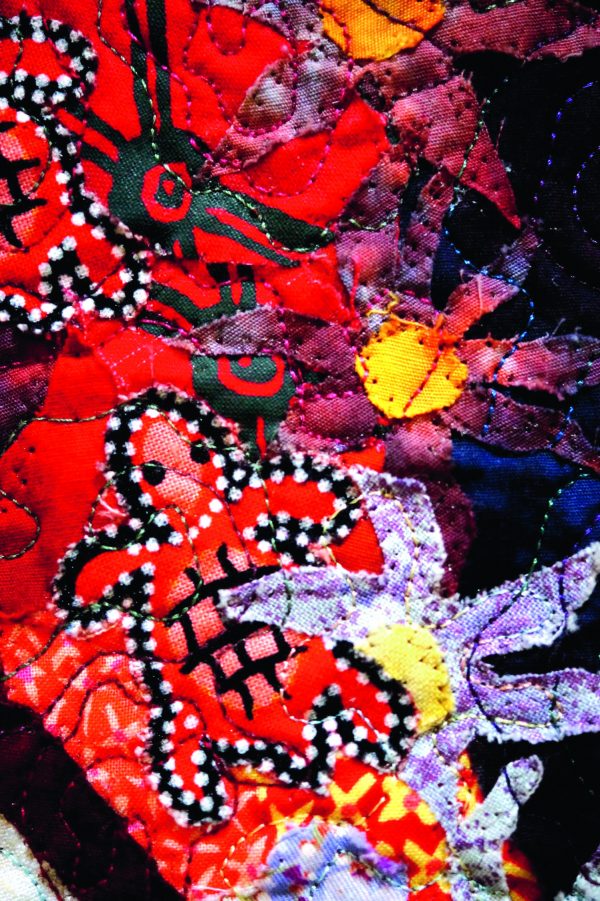
A piece of art work has to stand out and say “look at me”. It should draw people from the other side of the room for a closer inspection. To do this I needed to choose a composition that would have impact. That meant paying close attention to value and looking at ways to make the colours sing.
The main subject matter (the kangaroo) would have to take up most of the frame. The designated square format is sometimes difficult to work with and I spent a lot of time forming the composition, such as where to crop the ears and shoulders. I also reversed the image so he was looking out to the right. The eye is the focal point, so it had to be in a sweet spot (on or near the intersecting point of grid of thirds). I nearly always use my own images, but in this case I was not going to meet a big red in the near future and time was running out! I bought an image from “Dreamtime” photos and drew up the golden wattle after the head was completed and fitted it in (more about that later).
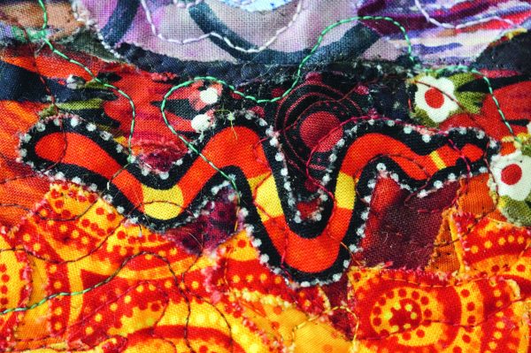
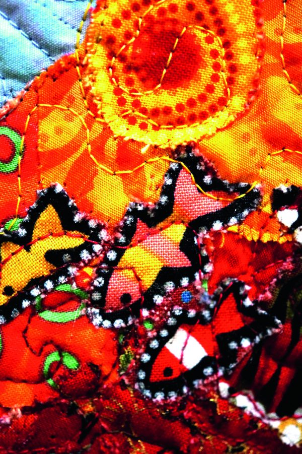
When people come close to inspect your work, they should be rewarded with interesting details and maybe even a surprise. Extra layers of meaning were added though the incorporation of Aboriginal fabrics — the circular elements, in particular, were enjoyable to incorporate. I also fussy cut native flowers and other little critters such as lizards, turtles, birds and fish (a bit like a Where’s Wally).
The colours are Australian: hot red, browns and orange earth colours were juxtaposed against cool blues and purples to create vibrancy. The golden yellow of the wattle, olive green leaves and cerulean blue sky round out the Australian landscape colours.
How did the design process work for you? Did you draw up a master plan or just start sewing? Did the specific size for the finished quilt affect the design?
Most of my previous work employs some or all elements of fabric collage, so I decided to use a technique in which I was confident. Sometimes I use a freezer paper stencil to add a shape and sometimes I do it free hand. Sometimes I fuse and sometimes I use a glue stick to attach the pieces. My process is often intuitive and I can’t always remember how I did things. This type of work does involve quite lot of “auditioning”. I have a large design board that I pin everything on as I go. I take a lot of photos for constant feedback. When I get stuck, I leave it for a day or two and come back with fresh eyes. A husband’s opinion can also be helpful (when asked for).
How is the quilt constructed and what are the main techniques used? Did you use any specialty products?
I traced the final composition onto a transparency and (using an overhead projector) enlarged it onto a white cotton pinned up on my design wall. This is a bit old school but it works for me (I live a long way from photocopying shops and they don’t always get it right!). I trace the design onto the fabric with a pencil, indicating large areas of values with a little shading. I would also be referring to both colour and grey scale versions of my edited source photo, which is pinned up nearby.
Indulge your love of appliqué with this stunning quilt pattern designed by Irene Blanck!
I then went through my stash and pulled out anything that related to the colours and themes I need. Looking at what I had, I decided to buy a few more Aboriginal fabrics for a good choice of patterns. I then sorted them into values, culling some along the way. Sometimes the back of the fabric works better than the front.
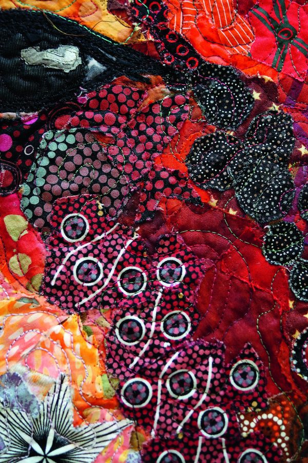
I began the design with the focal point and darkest element, the eye. Everything from there had to be lighter in value. A piece of black satin was used for the pupil.
The design continued with me adding pieces, pinning as I went. When I am happy with a section, I add a little dab of glue to the back to hold the pieces down. I use an acid-free ordinary glue stick used in schools. The fabric is easily removed if I want to change it. Make sure you don’t get it on the front, as it does show. The most difficult part was the kangaroo’s muzzle. I wanted it to have some lost edges. I think I did it four times before I was happy with it.
When I finished the head, I cut away from the white background. I auditioned a few backgrounds and a hand-painted sky piece won. It was then fused to this new background.
Using reference material from books (to make sure I had the correct attributes of this particular wattle), I drew up a “bone structure” for my wattle to hang on. I cut out a lot of circles and leaves, bunching them here and there over the entire background. I kept taking photos and when I looked back, I could see it detracted from the kangaroo head and that a smaller amount looked better. With my husband’s encouragement, I reluctantly removed two days’ worth of work.
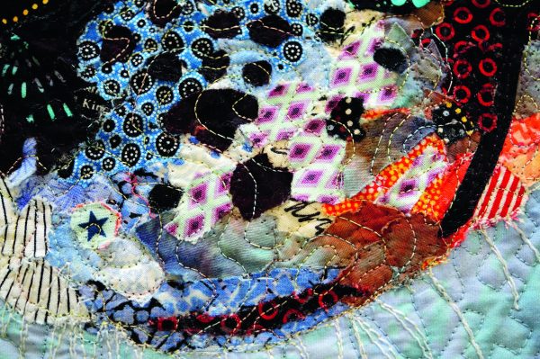
I decided to zig-zag the edges with “Superior” monofilament thread before I sandwiched the piece for quilting. I tried to catch all the edges, but still had to go back and glue a few down. The wattle blossoms were thread sketched before I remover the stabiliser.
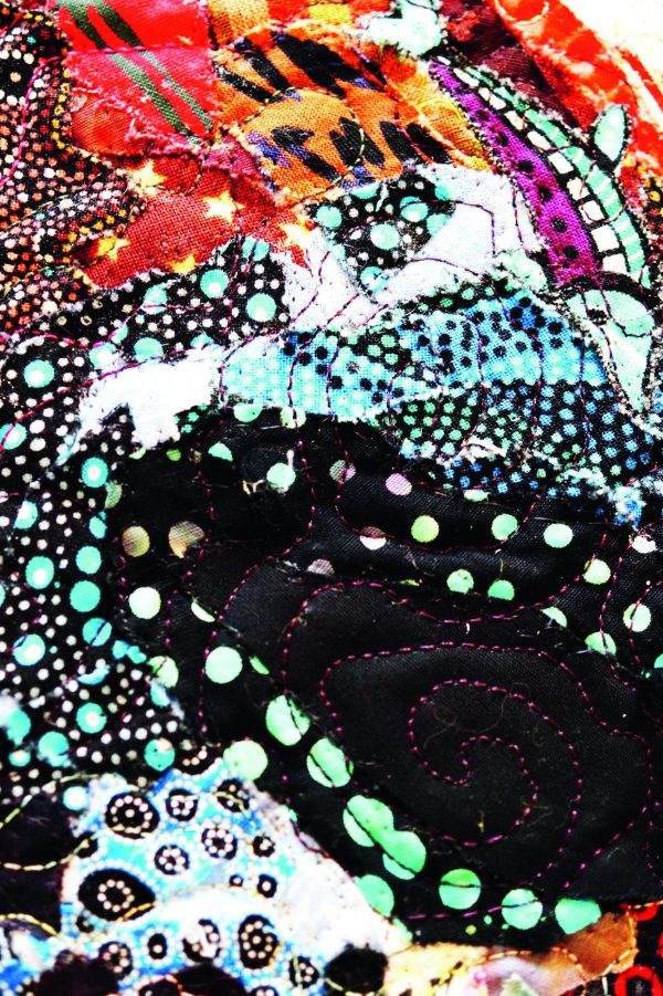
The quilting began with the kangaroo, using a swirly pattern in variegated 40wt cottons, which I changed according to tones. The design intention is for this part of the quilting to blend with the fabrics rather than be an obvious design element. I echo quilted around the leaves and blossoms and then added fillers. This background design was to suggest the patterning in some of the fabrics in the kangaroo, thereby adding some cohesiveness. Last of all came white and black whiskers with thicker 30wt threads.
The binding is a piece of screen-printed fabric from my stash. A “faced” binding would have been preferable, but there were too many layers of fabric in some parts to fold it over neatly.
Which awards has the quilt won?
I was honoured to win the 2017 AQC Challenge — Made in Australia: Flora & Fauna.
